00

Sylva
Brand + Product Strategy, Visual Identity, and UX Ecosystem Design
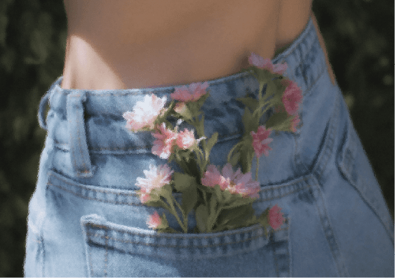
Women’s health isn’t linear. It moves, shifts, and responds to stress, seasons, hormones, culture, and daily life. Yet most wellness tools treat the women's body as static, offering generic plans built on male-centric data.
Sylva reimagines health as a living ecosystem for women via an app.
CONTEXT
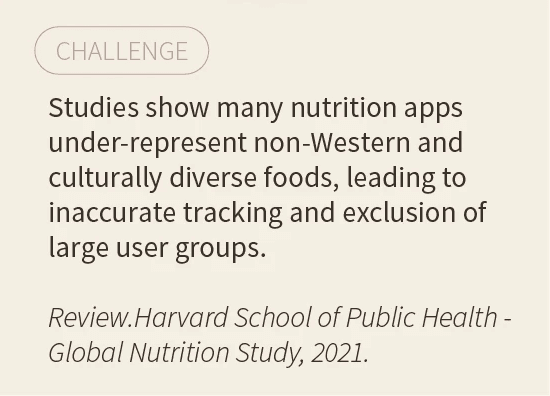
Women’s nutritional needs shift significantly across life stages, yet most tools provide static, generalized guidance. Research revealed clear gaps:
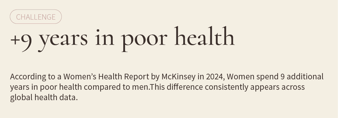
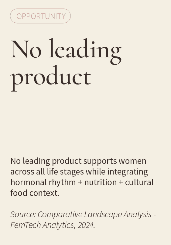
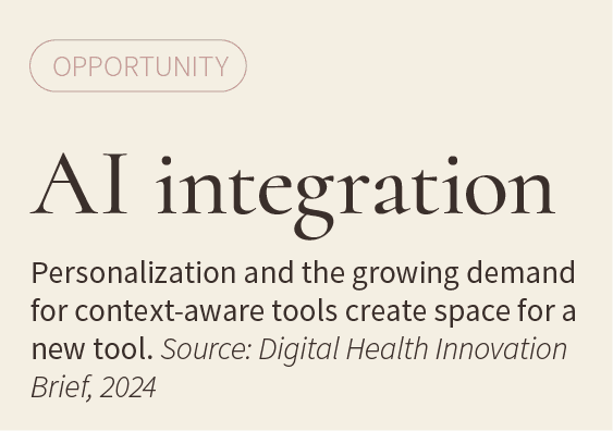
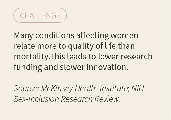
Despite rising investment and awareness, women still lack a system that understands their body and daily emotional drivers. To design Sylva as more than another wellness app, we needed to understand what truly shapes women’s nutritional behavior and health decisions.
This led to a deeper investigation into patterns, motivations, barriers, and ecosystem-level gaps.

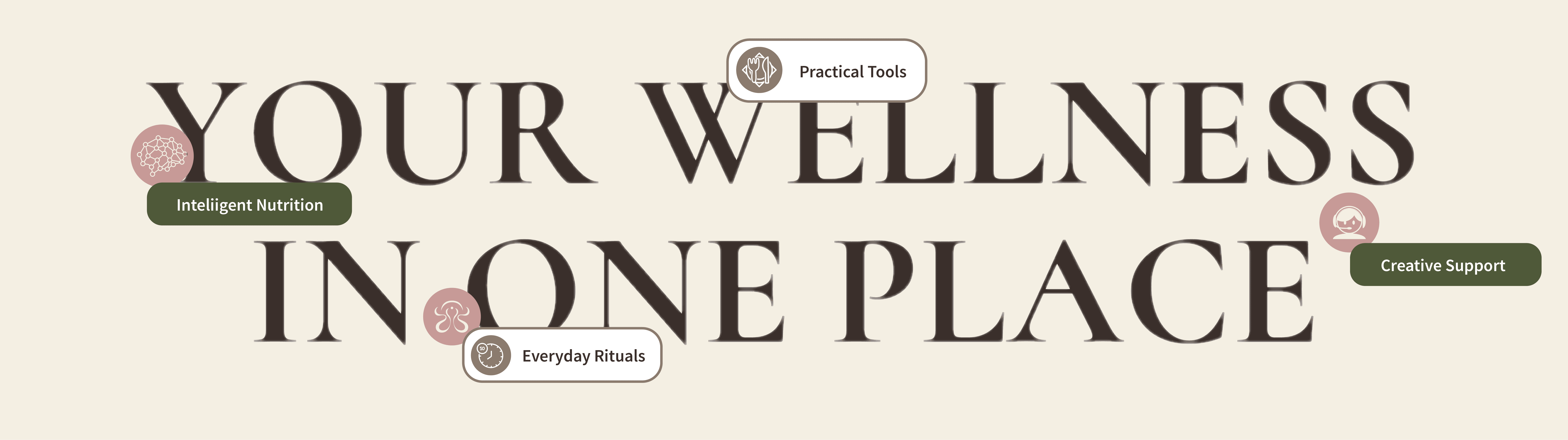
INSIGHTS TO EXPERIENCE
The four interconnected pillars that bring Sylva’s adaptive wellness ecosystem to life.
VISUAL DESIGN
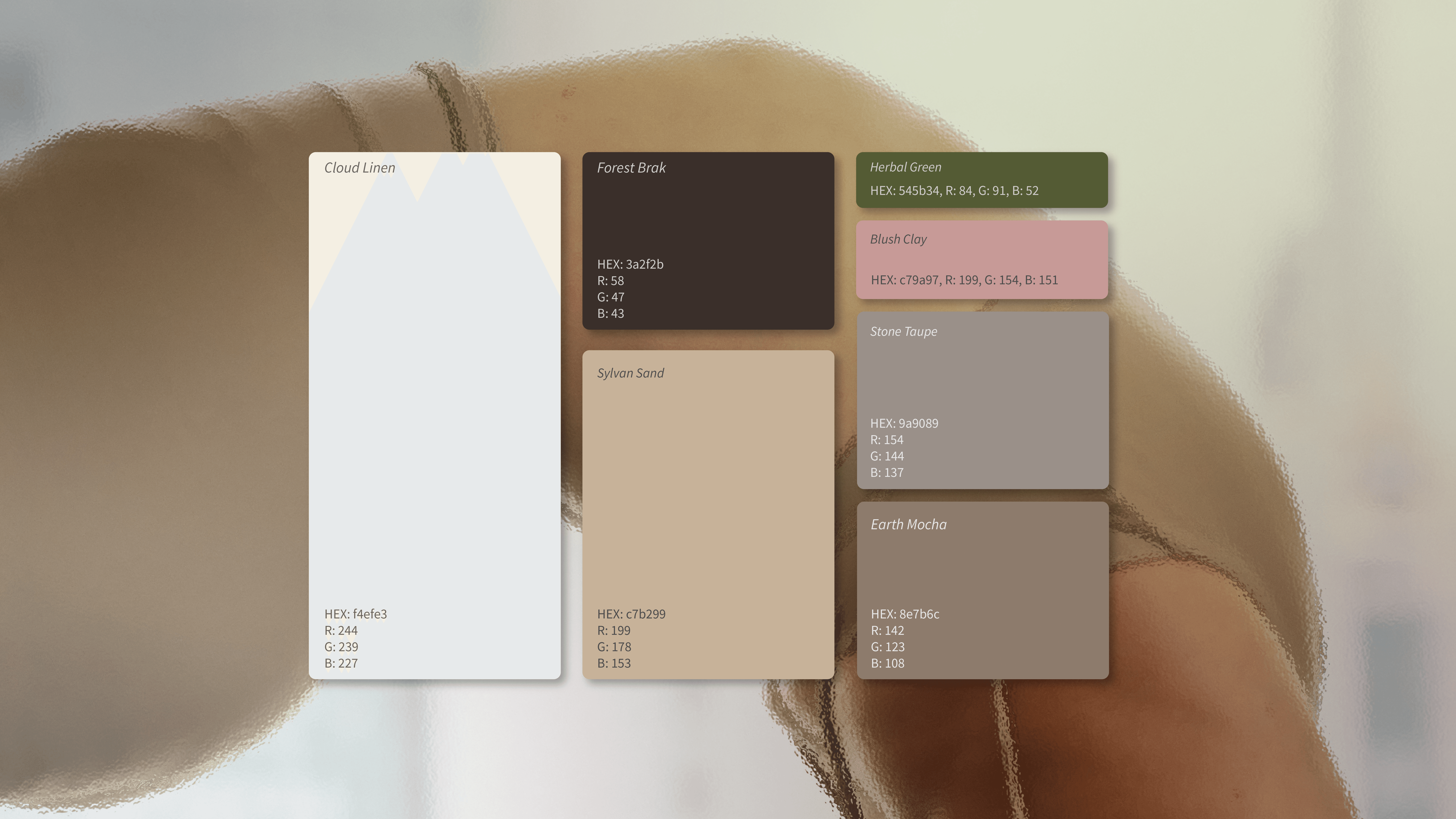
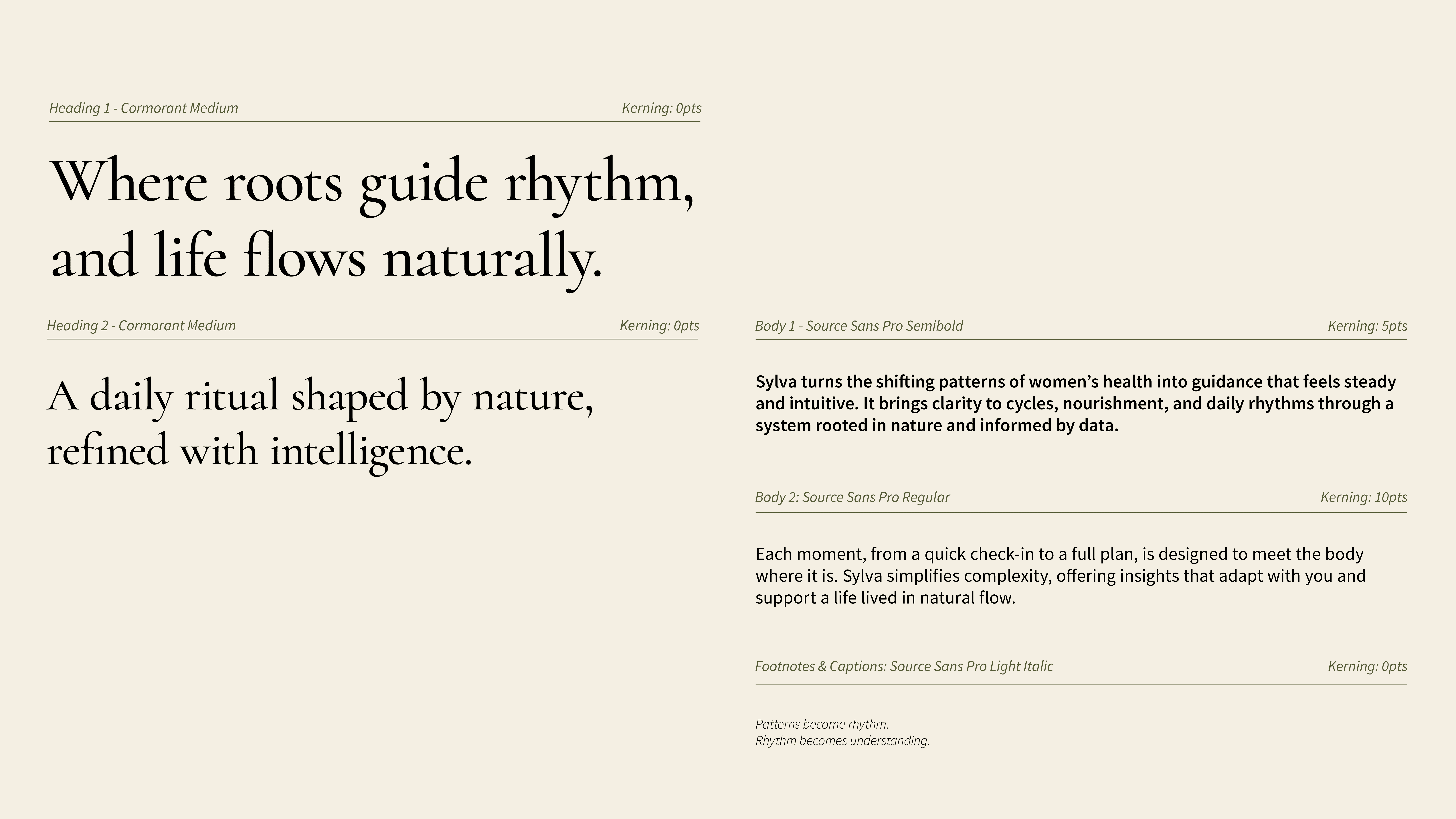
Rooted in organic forms and muted tones, Sylva’s visual language reflects the body as a living system.
Every element is designed to feel intuitive, calming, and intentional, supporting clarity without distraction.
LOGO

COLORS
TYPOGRAPHY
SCREENS

SCREENS

BUSINESS PROPOSAL BOOKLET
